Ohio State adds depth to its 2026 class with 7-foot-1 Serbian center Vuk Lazarevic.
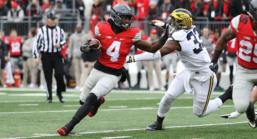
College football is the best sport in the world for many reasons, including the aesthetics of each team's uniforms.
It's almost too hard to keep track of it all, too, given most programs have a home and road uniform, plus alternates, different helmets with interchangeable decals... and so on. Even Ohio State, you may recall, wore SIX different uniforms last season.
That, naturally, makes it difficult to rank the entire Big Ten. But I've done my best, giving reasons for where each stands alongside my favorite look from each school.
These rankings are completely subjective, of course, and I'm looking forward to hearing how everyone else would rank them — or how wrong I am.
MOVING IN THE WRONG DIRECTION
14. Rutgers
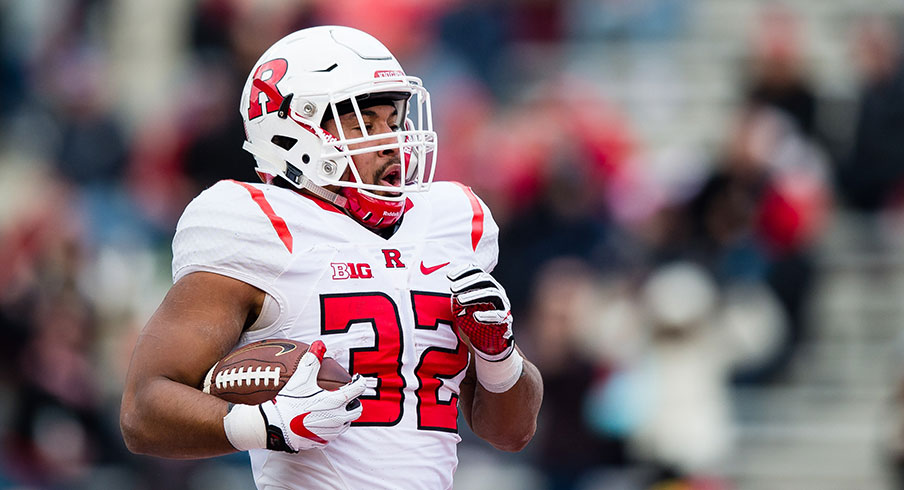
Patrick McDermott - USA TODAY Sports
Rutgers tinkered with its look over the last decade under Nike, finally striking what seemed to be a good balance between tradition and modern design with a chainmail pattern on the sleeves. However, the Scarlet Knights' switch to adidas this summer scrapped that entirely, moving to a generic, templated design.
LACKING AN IDENTITY
13. INDIANA
Marc Lebryk - USA TODAY Sports
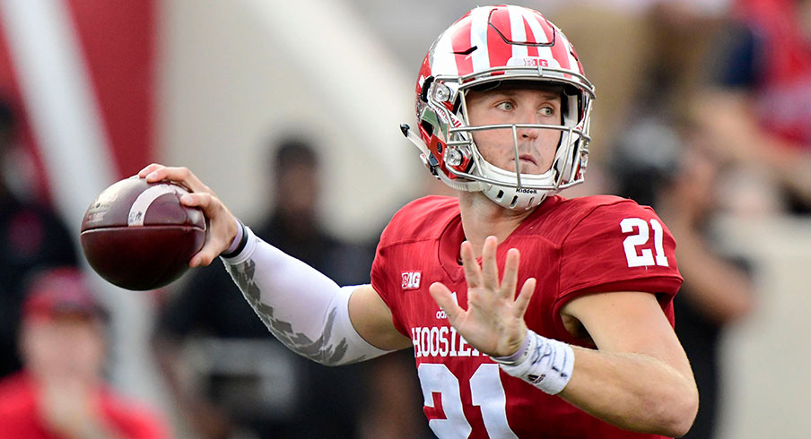
Indiana would be higher on this list if it adopted the candy-stripe design most often associated with the basketball team's warmup pants, as seen above. But a constant swapping of helmets and their logos — the state flag, the interlocking IU, and so on — muddies what could be among the conference's best.
12. MARYLAND
Tommy Gilligan - USA TODAY Sports
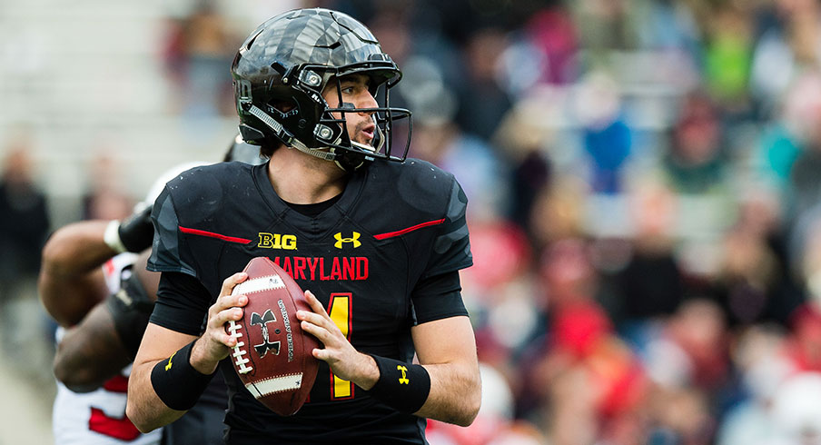
Maryland, the alma mater of former Under Armour CEO Kevin Plank, was the company's first foray into college football uniform design. The Terrapins haven't been able to decide whether they should embrace a turtle motif or the state flag, putting them in a similar situation as the Hoosiers. Toning the latter down, as seen above, can yield great results, though.
TIME FOR SOMETHING NEW
11. NEBRASKA
Bruce Thorson - USA TODAY Sports
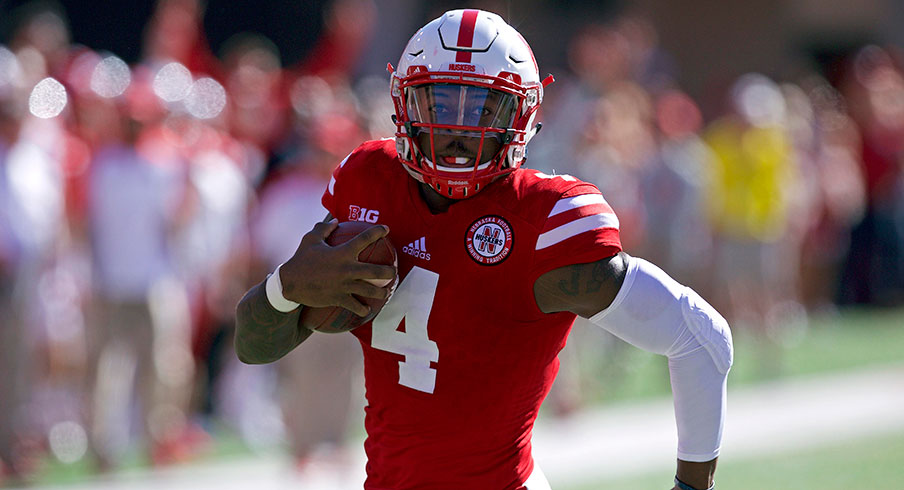
Nebraska has one of the most traditional looks in all of college football, but adidas' insistence on outfitting the Cornhuskers in cheap-looking alternates just to remain trendy has hurt their overall look considerably. And I haven't even mentioned how similar they look to Big Ten for Wisconsin — though I know former Badgers athletic director Barry Alvarez carried it over from his playing days with the Huskers.
10. WISCONSIN
Jeff Hanisch - USA TODAY Sports
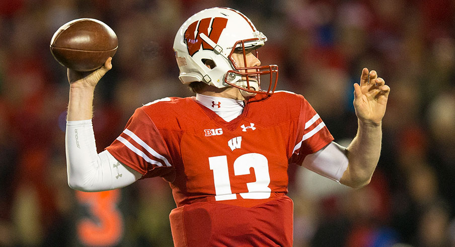
The Badgers were in the same boat when it came to alternates under adidas, but a switch to Under Armour — which has been knocking designs out of the park recently — put an end to that. Additionally, what sets this look apart from Nebraska is the arrows on the stripes to signify the program moving "forward."
9. IOWA
Jeffrey Becker - USA TODAY Sports
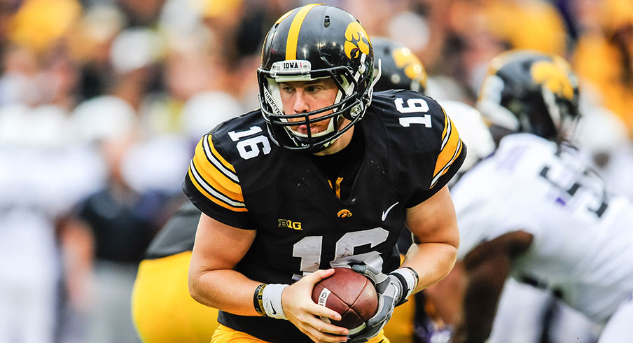
Though former Iowa head coach Hayden Fry asked the Pittsburgh Steelers to use their uniform design in 1979, you could argue the Hawkeyes look better on the field today than their professional counterparts — block numbers compared to italicized. But still, Iowa would be best served to create an identity all to itself, similar to that of the well-received alternate uniforms it wore last fall.
MODERN, YET TASTEFUL
8. PURDUE
Trevor Ruszkowski - USA TODAY Sports
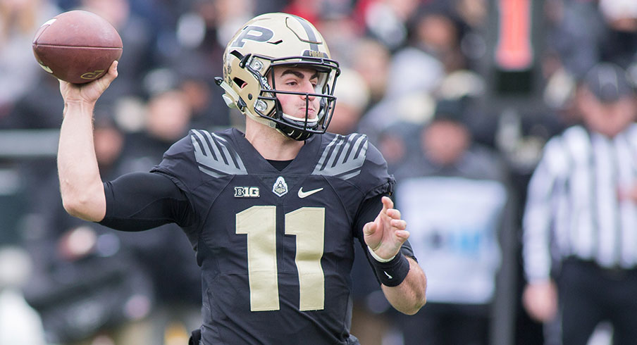
Purdue's black and athletic gold combination is nothing special, but the Boilermakers' decision to embrace their alternate train logo has created a one-of-a-kind look in college football. A sublimated cattle catcher, actually used to deflect objects such as cows on the railroad, and the extra large numbers really help a uniform — that would otherwise be quite dull — pop.
7. ILLINOIS
Mike Granse - USA TODAY Sports
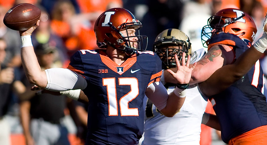
A program-wide rebrand in 2014 moved Illinois from dead last in the conference to among the most forward thinking. The Illini previously suffered from issues with random piping, but now strike a balance between tradition and innovation with sublimated Red Grange era stripes and anodized orange and blue helmets. The soccer-style crest on the collar is a nice touch, too.
6. NORTHWESTERN
Jeffrey Becker - USA TODAY Sports
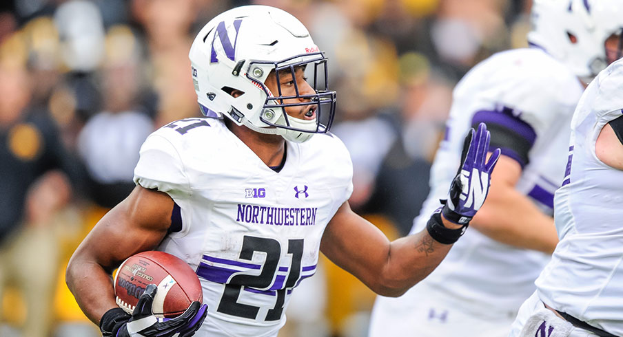
You're correct if you sense a theme when a program moves away from adidas, as Northwestern did in 2015. The Wildcats' pact with Under Armour created a unique look by placing the stripe the program pioneered across the chest of the uniform — uniform stripes are typically on the sleeves or shoulders. Purple and black is such an underrated combination, too.
5. MINNESOTA
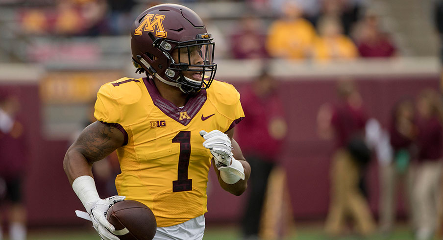
Jesse Johnson - USA TODAY Sports
If it were based on the above uniform — maroon helmet, gold jersey and maroon pants — alone, Minnesota would be in the top tier of the Big Ten. The brick motif in the numbers really sets this look off, but the Gophers' constant use of white pants at home, when there's no white anywhere else on the uniform, knocks them down a few rungs.
ABSOLUTE PERFECTION
4. MICHIGAN STATE
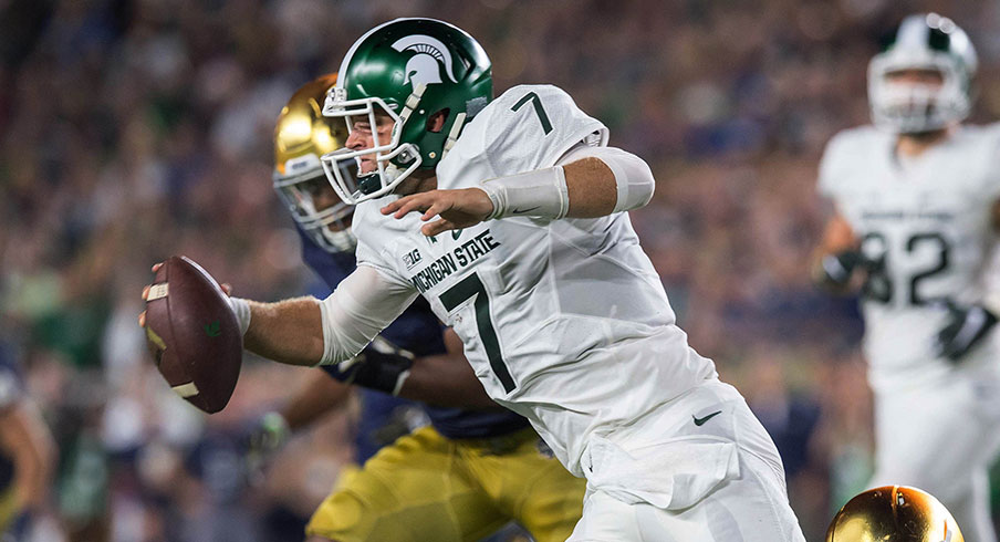
Matt Cashore - USA TODAY Sports
Michigan State has been trying for years to incorporate some kind of spartan motif on its uniforms — whether it was bronze helmets or trim around the numbers. A pattern on the sleeve, however subtle it may be, was finally the right move. The anodized helmet really sets the look over the top for the Spartans, especially with the road whites.
3. PENN STATE
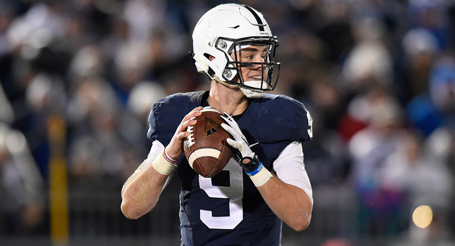
Rich Barnes - USA TODAY Sports
Save for a few minor changes with new templates, Penn State's uniforms have remained unchanged for what seems like forever. The Nittany Lions' blue and white getup isn't anything flashy, but it'd be hard to improve the simplistic look. Maybe numbers on the helmet, but that's just grasping for straws.
2. MICHIGAN
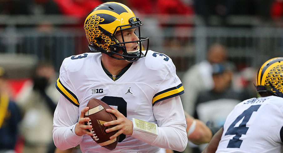
Joseph Maiorana - USA TODAY Sports
After years of unfortunate alternate uniforms and mismatched colors, Michigan finally got it right with its move to Nike subsidiary Jordan Brand bringing cohesive coloring and a custom number font. Head coach Jim Harbaugh's decision to go with white pants on the road makes the new satin helmet pop, too.
1. OHIO STATE
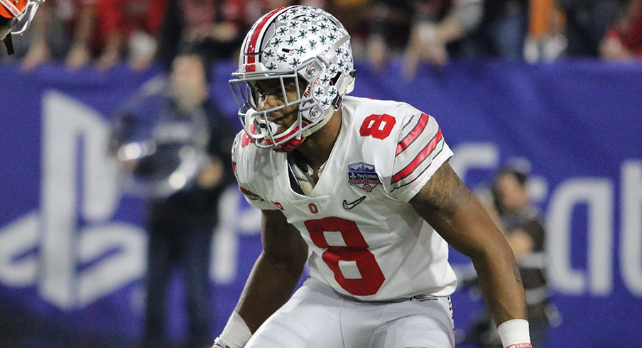
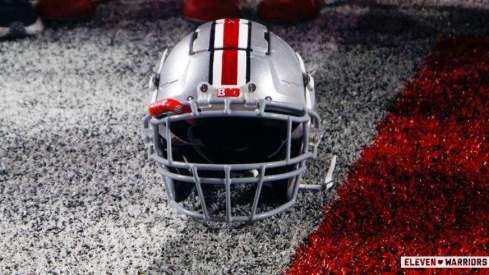
Much has been said about Ohio State's current sleeve stripes, which — design wise — match the helmet and pants perfectly. The road uniforms worn in the Fiesta Bowl, however, with a helmet full of Buckeye Leafs and the stripes as seen above, are the Big Ten's best — and maybe even the best in the entire country.
