Last week when Ohio State announced that it had dutifully revamped its logos the reaction was, well, hostile.
Brand-refreshing comes with just a handful of possible outcomes, and the university was likely hoping for either no or little reaction. Instead it got scorn and ridicule – still better than a full-blown coup d'etat – but certainly not what the leadership had to be anticipating.
![New Coke! You'll love it much more tha-[AMERICA EXPLODES]](http://www.elevenwarriors.com/sites/default/files/c/2013/02/Screen%20Shot%202013-02-09%20at%2012.33.28%20PM.png) Ohio State changed its athletic logo. Fan response was consistent.
Ohio State changed its athletic logo. Fan response was consistent.Ohio State began working on this update back in 2011. It conducted hundreds of interviews to determine exactly how to maintain some cohesiveness between different moving parts of a giant, fluid organization.
It was agreed that the Block O, a pillar of collegiate iconery, would continue to do the heaviest lifting. That O consistently appears throughout the various emblems.
Cosmetically the rest of the athletics logo is decidedly 20th century, having been used by the athletic department since John Cooper arrived on campus.
Still, following all of that consultation, the logo was ultimately tweaked with an MS Paint bucket fill and, quite literally, several seconds worth of graphic design: "OhioState" is now black instead of black outline.
Channeling Coco Chanel: Fashion changes, but style endures.
Irritated Buckeye stakeholders are not exhibiting Rwanda genocide-level outrage, but the problem lies within the context of organizational change.
It's the context of knowing what it costs to change so much as a font on business cards and letterhead for a leviathan organization. It's also speculating what the university likely paid for this "creative" work (as it turned out – only 45 large!) coupled with the pricey end result chaffing a fan base that has already heard way too much recently about President Gordon Gee's expensive taste.
Creating Ohio State's new logo: When parody meets reality.
Changing any aspect of Ohio State's tradition, even with the level of subtlety seen in the logo tweak (no one over the age of 60 can tell the difference without squinting) will inevitably cause angst.
Brands don't just belong to their respective organizations. Consumers stake their ownership in the brand as well. They're your Buckeyes too.
Take, for instance, the piping on Ohio State's football jersey sleeves. In 2006 the gray and red stripes that had been in place since the late 1980s were changed to a red and black B-side version of what runs down the middle of the Buckeyes' helmets.
A minor cosmetic change, but many fans were incensed. Compounding the anger, Nike also changed the uniform material seemingly to allow for full visualization of how each individual's sweat glands were functioning during games.
It was change nobody asked for but got anyway. That's cause for more chaffing. Change is hard, especially when it isn't understood.
CALIFORNIAREYOUKIDDING
But Ohio State wasn't dramatically altering its brand or core value proposition. It changed a few shoulder stripes on a jersey. Regardless of the intent, it abruptly rendered thousands of fans' replica Saturday costumes out-of-date.
 Left: Old Cal logo. Right: New (recently withdrawn) Cal logo.
 Late last year California dramatically altered all of that – branding, value proposition, tradition – with some crazy, insidious refresh of a classic brand in no need of being changed.
Cal's internal committee even punted its school colors in favor of the San Diego Chargers powder blues (everyone loves those!) and incorporated a gradient that would be nearly impossible to adequately transfer in most print applications.
Worst of all: All of that effort was expended to create something that the average person with no experience in graphic design could easily identify in under five seconds as being an unconscionably bad idea.
Left unchallenged, otherwise intelligent people in closed-door meetings can take bad ideas to new heights by simply agreeing with each other too much.
The SCHOOL HAS TWO FACES
It's clear why Ohio State – nor any other institution – is unwilling to be too daring with wholesale brand refresh: High potential for blowback.
Deciding to maintain the classic Block O without deviating for something new (like a perfect circle, an oval, an italicized O, an avant garde representation of roundness, etc) was both calculated and cautious.
But once the opportunity to update the brand is taken, the window is briefly open. You don't want to have to open that window again anytime soon.
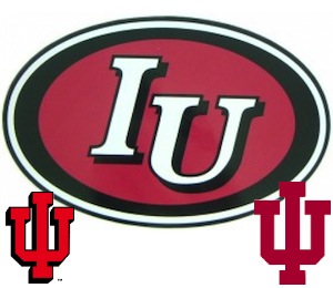 See if you can spot Indiana's logo fail. Don't think too hard.
You definitely don't want to make frequent changes, as Jim Delany is now discovering in cleaning up the B1G's classic overbranding disaster with Legends and Leaders.
It's an admission of failure. No one likes to admit that, least of all the Big Ten's Emperor Palpatine.
Radical changes can be made more easily where no tradition exists. Wisconsin's W Rising logo was able to take hold because Wisconsin athletics were an afterthought two decades ago when the change was made.
Indiana replaced Bill Mallory with Cam Cameron and gave its football program a new logo. The basketball program, still run by Bob Knight, understandably wanted absolutely nothing to do with it.
The black oval logo/uniforms era left Bloomington with Cameron. It failed because of poor design and poorer execution by Cameron's Hoosiers, which made the oval toxic. If anything, IUFB should exploit IUBB's brand recognition, not run from it.
And they've done that since Cameron's departure, unifying IU's athletics brand once again. Note that IU – as well as Cal Berkeley – have two of the nation's better business schools. Brand mismanagement can happen to anyone.
Separately, but still in Indiana, Purdue's italicized P debuted and replaced its traditional P emblem without any scorn largely because nobody noticed. Not even Purdue.
HOW FIRM THY CHECKBOOK
Ultimately the angst toward Ohio State's new logo is around the idea that Ohio State actually paid money for it.
Free alternatives – serious ones, even – are already being offered up by OSU stakeholders frustrated with the university's choice. Controlling one's own brand is of dire importance. It's always been vital to Ohio State. Unfortunately, as most giant organizations do, they often overspend for a solution.
Back when it failed to realize the gravity of its football coach overtly lying to the NCAA, and then unsuccessfully lost any control of the story direction or the media narrative, Ohio State hired the Kekst disaster management team to do some emergency PR work.
You probably remember how Kekst helped rehabilitate Ohio State's image to the public. Oh, you don't?
The bill for that largely invisible work was $270,000, or $225,000 more than it paid for the logo work. Kekst did nothing to help smooth over the university's image with the public. If anything, it continued to spiral – until that Urban guy was hired. Not sure Kekst had anything to do with that.
To put that in perspective: Eleven Warriors could have done an exponentially better job with repairing the university's image than Kekst did – and Ohio State could have paid us in food to do it.
And that's where the hostility toward Ohio State's brand management intersects with Ohio State's consumers: We want it to be better. You want it to be the best.
You are mad because you care too much. It's okay; we all do.