It's the dog days of summer before football action starts in the fall. So what is your favorite logo in the Big-10. Let's be objective about this. Or try to be. Or at least pretend to be.
Here is the objective ranking of this art critic. Agree or disagree?
14. NEBRASKA. A plain red N just doesn't cut it, especially sans serif. And the slogan "Big Red" just doesn't have the cache of "Crimson Tide."

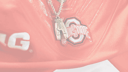
13. OHIO STATE. An octagonal O with double outlines and with the name written across it in an arch is messy, cluttered, busy and artistically it has the "bull's eye" problem. It is unique, but uninspiring, perhaps even ugly. And all the small lines do not show well on a TV screen.

The next 7 team logos bunch together. They are all block letters of various colors. Pretty boring, even when they try to make the letters unique.
12. ILLINOIS. A standard block I in orange with a navy blue border. It's rated lower because this orange with blue is an unappealing color, unlike the unique orange for Tennessee or the burnt orange of Texas.

11. RUTGERS. A standard block R in red with a thin black border. Yawn.
10. MARYLAND. A red block M with yellow and black trim. It get's style points for pointy end tips, and for the Maryland coat of arms at the base, but that's almost unnoticeable.
9. MICHIGAN. The simple yellow block M is bold and strong and shows well on TV, but it is so uncreative and so "totally yesterday." This former Ohio farm boy has trouble even looking at this.
8. MINNESOTA. This yellow upside down block W looks like an M that's splayed out like somebody lost their footing on the ice up there. But after you slip and fall you realize it's a W. At least it's not an uncreative block M like the logo from "TTUA," that team up above.
7. NORTHWESTERN. Another block letter; this time a purple N. But it is modernized with the elegant diagonal strips. Simple, clean, classy.

6. WISCONSIN. The last of the block letters, this red block W was rated higher because it has some nice touches. It's curved, and it has a nice off-set back shadow. But it's still basically just a block letter. Now on to the good stuff.

5. INDIANA. A trident formed from the U and I of Indiana University seems so refreshingly creative after all the single block letters, even if it is just two elongated letters.

The "final four" represent logos with objects rather than just letters.
4. PURDUE. A train engine with a big cow-catcher is an eye-catching way to picture the boiler from the Boilermakers. It depicts speed and power. Too bad the team is a train wreck.

3. MICHIGAN STATE. The abstract silhouette of a Spartan helmet provides the mind's eye with a dramatic image of an ancient warrior for modern times. It's like the USC Trojan logo, except chiseled, cleaner, a more modern abstraction.

2. PENN STATE. The stylized outline of the head of a silver panther inside a navy-blue oval is very elegant-- clean, sleek, shiny. It's almost too elegant, like a woman's house-cat with a silver collar.
1. IOWA. The abstract of a hawk's eye is sharp, dramatic and distinctive. Like the modern Penn State logo, only much more so, this image is created more by what's not drawn than what is actually seen. And in yellow and black it's a dramatic image of a hawk with it's keen eye looking for prey.

There you have them. All 14 Big-Ten logos.
What would be your ranking of which is best?
