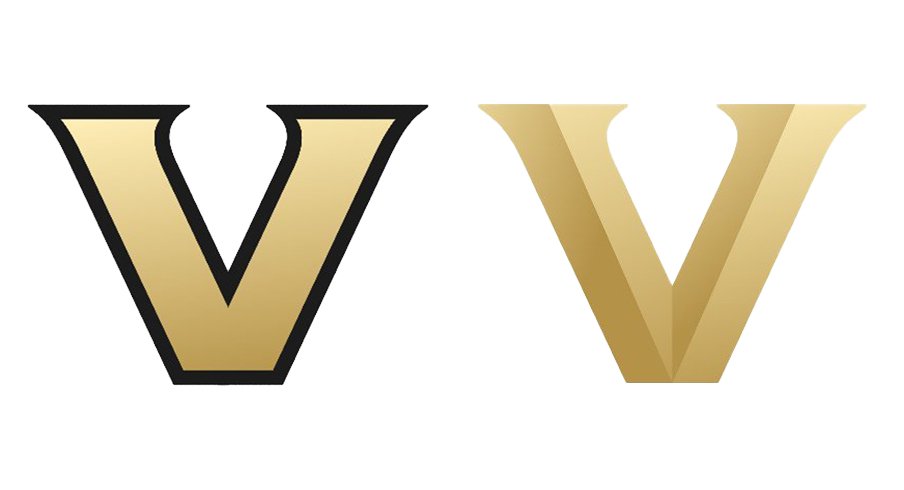
When Vanderbilt rolled out its new logo on Tuesday, they hoped people would see it as "a refreshed visual identity designed to reflect the university’s forward momentum and to build pride and visibility across the institution."
What they got was... not that.
But that's what happens when you debut two new logos you presumably paid a lot of money for that look like they made using the "WordArt" feature in Microsoft Paint.
Let's take a look at the reviews!
Couldnt come up with anything better than a history channel logo knock off ? pic.twitter.com/aXJu3BvIui
— al (@AlexGrant13) March 22, 2022
— Brett Garrett Meeks (@meeks102) March 22, 2022
they've done it across all their accounts, i think its supposed to be on purpose,,,, which makes it so much worse
— rahan oak leaf logo era (@rahanfromtehran) March 22, 2022
Random logo generator does a better job pic.twitter.com/J3eEzbQLH3
— Vandy Dores (@nash_vandy) March 22, 2022
this is the logo a movie uses when they couldnt get the rights to use Vanderbilts logo. its so bad https://t.co/EncmkyupNe pic.twitter.com/DtyrtqSXdT
— Nathan (@NathanJH31) March 22, 2022
God, this is so incredibly bad. The fact that this went through the channels being claimed by this message is even more sad and disappointing. This is the level of work id expect from a middle school design student on Canva.
— Ethan Fedida (@ERFedida) March 22, 2022
A word art, gold V is not demonstrating Vanderbilt well to the world. Lofty rhetoric doesnt cover for lacking design.
— Brooks Cain (@brookscain) March 22, 2022
This is a solution in search of a problem.
— kempette (@kempette) March 22, 2022
This logo could belong to any university or corporation that starts with a V. It has no character, no personality; nothing to indicate that it represents Vanderbilt in any way. Sometimes new is not better.
An upside down butt plug is your new logo? Keep on being Vandy.
— Donnie (@thesouthrhead0n) March 22, 2022
If only somebody could have told them this was bad beforehand!
I am so baffled. The fan council provided A LOT of feedback on this subject at our November meeting.
— Justin Kirby (@jakirby89) March 22, 2022
The consensus was keep the Star and standardize the shade of gold we use in merchandise.
Ugh.
100% - from everything I've heard the student leaders, fan coucil, alumni groups etc that they did consult gave this feedback over the last 6 months. They ignored the focus groups and then pushed ahead. This needs to be done outside of a vacuum.
— Ethan Fedida (@ERFedida) March 22, 2022
Personally, I can't wait to see the XFL-ass uniforms they inevitably roll out alongside the new logo. Although the reality is, I'm not sure I've watched a Vanderbilt game on purpose since like 2013.