BOOM
Five-star defensive lineman Marcus Fakatou commits to Ohio State.
Five-star defensive lineman Marcus Fakatou commits to Ohio State.

Flags.
Everybody wants a flag. Schools, cities, townships, states, countries, whatever. People want a flag because it's a physical representation of what the people from whatever is being represented want you to think about then you're visiting. Sometimes they want you to know that they figured out how to make text effects in PowerPoint. Sometimes they want you to know that they are having an epileptic seizure (looking at you, Maryland). Other times it's that they want you to know that they're okay with being a flyover state, and the flag is really just a vehicle for their state logo, which we all know is really where the sausage is made.
Anyway, for whatever reason people get seriously attached to their state flags, even if in the back of their minds they have a sneaking suspicion that their state flag actually sucks. That can be rough, so this week I've decided to not just do my usual rankings, but also provide a handy, three step guide for people not in the B1G footprint to objectively determine if their state flag indeed sucks. I can't pretend to be definitive, but if your state flag meets two out of the three criteria, there's a decent chance that it sucks.
For anyone still unsure after reading this post, spoiler alert: it probably does.
Criteria #1: Is there text somewhere on the flag? YES.
Criteria #2: Is the flag just a lazy vehicle to show off the state seal? YES.
Criteria #3: Is the flag completely unrecognizable outside of the state that it represents? YES.
The Illinois state flag is complete BS for many, many reasons. If you looked at it from more than 10 feet away, it's pretty likely you'd mistake it for the soiled bedsheets of some unfortunate bed pooper at summer camp. Perhaps enticed by that insane idea for a state flag, if you looked at it from less than 10 feet away, you'd notice that it's not poop, just a very poorly rendered bald eagle.
What the bald eagle holds in its beak is what makes the flag (and state seal) truly, madly, deeply awful. The ribbon reads "State sovereignty, national unity" and if you know anything about US history, you know that those two things were diametrically opposed to each other in the 1850's. Illinois' solution? Write "sovereignty" upside down. YEAH THAT'LL SHOW EM!
Criteria #1: Is there text somewhere on the flag? YES.
Criteria #2: Is the flag just a lazy vehicle to show off the state seal? YES.
Criteria #3: Is the flag completely unrecognizable outside of the state that it represents? YES.
 They go pretty well together!
The state flag of Minnesota looks like someone chewed up a bunch of crayons and then spit them out on blue construction paper. The half assed attempt to make the thing look like a sheriffs' badge really reinforces the idea that it was thrown together by a 3rd grade class in Minneapolis right before naptime. Bad.
Criteria #1: Is there text somewhere on the flag? YES.
Criteria #2: Is the flag just a lazy vehicle to show off the state seal? YES.
Criteria #3: Is the flag completely unrecognizable outside of the state that it represents? YES.
The only thing that makes Nebraska's flag marginally better than Minnesota is that if I saw it, I wouldn't say to myself, "Wow, that is a horrible abomination of a flag and only serves to make the other flags around it look better by comparison." Instead, I'd probably say something along the lines of "Check it out, it's one of those Magic Eye things, except the hard part is already done for you!"
Look, the North American Vexillological Association knows their stuff, and though I don't rank the flag of Nebraska quite as low as they do, I think it shows that I've created some pretty solid criteria here.
Criteria #1: Is there text somewhere on the flag? YES.
Criteria #2: Is the flag just a lazy vehicle to show off the state seal? YES.
Criteria #3: Is the flag completely unrecognizable outside of the state that it represents? YES.
Let's this this out of the way first: yes, I am aware that "tuebor" is a legitimate Latin word, and that it means something fairly noble in that it says "I will defend." Cool, great, except that "tuebor" sounds and looks like the name for a 1950s robot from the planet Neeglrr hell-bent on ripping the clothes off unsuspecting co-ed astronauts.
The rest of the flag is your standard state seal on a blue background, although I've rated Michigan's state seal on a blue background slightly higher than the other state seals on blue backgrounds because this state seal on a blue background has a moose in it. Also, it's not technically the state seal, it's a coat of arms, but really that would just start me down a whole monarchists rant that no one really wants me to go in to.
Criteria #1: Is there text somewhere on the flag? YES.
Criteria #2: Is the flag just a lazy vehicle to show off the state seal? YES.
Criteria #3: Is the flag completely unrecognizable outside of the state that it represents? YES.
Same crap, different state, BUT I can't deny that I am a total sucker for dates on flags. Hypocritical, I know, but as a history teacher I just get inherently giddy over anything that indirectly teaches a historical fact about something. Really, if they just ditched the coat of arms and made the entire flag just the number "1848" on a Holstein-spotted background, there probably wouldn't be a person in this country who didn't know which state it was talking about.
Criteria #1: Is there text somewhere on the flag? YES.
Criteria #2: Is the flag just a lazy vehicle to show off the state seal? YES.
Criteria #3: Is the flag completely unrecognizable outside of the state that it represents? YES.
Three yeses, but hey, woah, what's this? A buff colored flag? A horses head for some reason? A toque?!? SOLD.
Criteria #1: Is there text somewhere on the flag? YES.
Criteria #2: Is the flag just a lazy vehicle to show off the state seal? ...Maybe?
Criteria #3: Is the flag completely unrecognizable outside of the state that it represents? YES.
One of the reasons I'll give the state flag of Pennsylvania a semi-pass is that the coat of arms that, naturally, appears on a blue background is actually blown up to the size in which you start to think that is something the state is actually proud of, rather than a dumb coaster that someone stuck on as an afterthought. Not that the coat of arms actually makes any sense whatsoever ("Horses! A boat! Some wheat despite Pennsylvania not actually producing much wheat at all!") but screw it, this is the first flag on this list to actually have some effort put in to its presentation. Congratulations on being barely mediocre!
Criteria #1: Is there text somewhere on the flag? YES.
Criteria #2: Is the flag just a lazy vehicle to show off the state seal? Nope!
Criteria #3: Is the flag completely unrecognizable outside of the state that it represents? Probably, but that may be the point.
I secretly like the state flag of Iowa for one very specific reason, and that is because it seems to be a secret slam on the French flag that is closely mirrors. My thinking is that the flag is part of an elaborate ruse by the Iowa tourism board to convince French tourists that Iowa is a really French-friendly state. "Oui! Such a beautiful flag!" they will exclaim, before coming closer and BAM! Giant bald American eagle right there in the middle, don't you feel stupid? Why would you even go from France to Iowa in the first place, God you're dumb.
Criteria #1: Is there text somewhere on the flag? YES.
Criteria #2: Is the flag just a lazy vehicle to show off the state seal? No.
Criteria #3: Is the flag completely unrecognizable outside of the state that it represents? Somehow no!
I really enjoy the state flag of Indiana. Yes, it still has that obnoxious text that reminds people looking at it from 10 inches away that it is the state flag of Indiana, but in reality it doesn't really need that. The torch and the unique arrangement of stars around said torch are recognizable enough, and maybe if they hadn't stuck with the yellow on blue motif I'd have them at number one (absolutely not).
All in all, it's a pretty cool flag for a pretty uncool state, cool enough that it might actually convince a 6 year old kid to spend several futile minutes asking his parents to go on vacation there. That's not a bad accomplishment for Indiana!
Criteria #1: Is there text somewhere on the flag? No
Criteria #2: Is the flag just a lazy vehicle to show off the state seal? No way.
Criteria #3: Is the flag completely unrecognizable outside of the state that it represents? Not in the least.
Pro style. This is how you make a state flag, kids. I guess if you were a major hater you could say that it could double as a stress test for epileptics, but the truth of the matter is that it sticks out more than almost any other state flag, is colorful, and best of all, doesn't represent an embarrassingly racist and secessionist past that would bring shame to all those who live under its banner today.
OR DOES IT?? Yeah, sorry to be the bearer of bad news, but that neat red and white cross? It was used by Maryland Confederates during the Civil War as their state symbol. I guess the flag makes up for it by also including the black and yellow Union state symbol, but (to paraphrase a great man) do you want to be a winner or the opposite? Then drop the cross, throw up deuces, and step on it.
Criteria #1: Is there text somewhere on the flag? NO.
Criteria #2: Is the flag just a lazy vehicle to show off the state seal? NO.
Criteria #3: Is the flag completely unrecognizable outside of the state that it represents? NO.
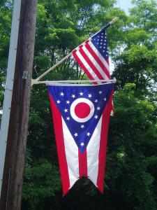
One of the easiest calls to make out of all the lists I've done (assuming that I'm not just ranking Ohio number one every single time for the hell of it). Ohio, as you probably already know, is one of only two flags at the state level or higher in the known universe to be pennant-shaped. Its brother is the flag of Nepal, an awesome flag in its own right, but let's be honest: the Ohio flag is head and shoulders above nearly every flag everywhere.
What's remarkable about the Ohio state flag is how much symbolism they managed to pack in to a relatively simple design. The "O" obviously stands for "Ohio" but it's colored in such a way as to resemble a Buckeye nut. The five stripes are symbolic of Ohio being one of the five Northwest Territories, the 13 stars on the left represent the 13 original colonies, and the other four show that Ohio was the 17th state admitted to the US.
See? Ohio can be deep, man. You just have to look a little closer at us.
And that about does it! Ohio dominated this one, easily, and I am also confident that the Buckeye state will somehow find a way to the top spot of next week's list, when we tackle the best television show set in each of the B1G states. See you then!
The B1G List: State Birds | State Mottos | State Flowers | State Songs | State Fossils

