
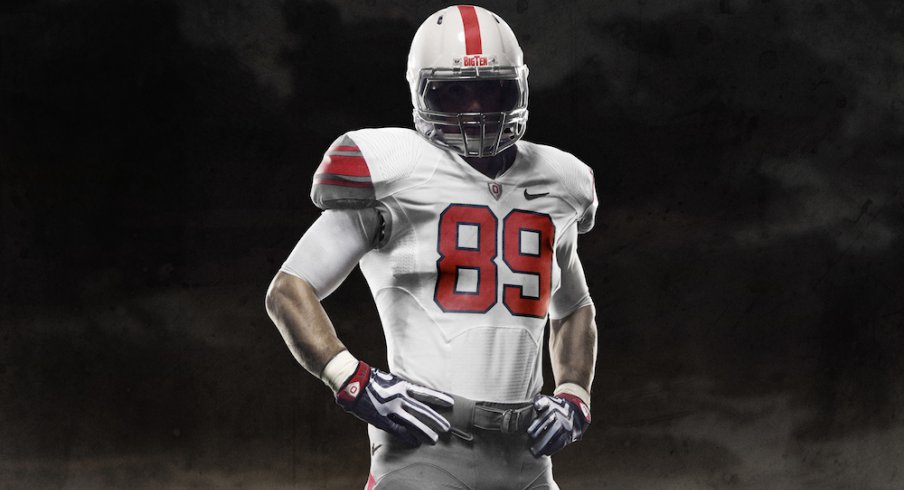
Photos of the Rivalry Uniform have leaked out ahead of the unveiling set for 11/15*. The official team shop at the Schottenstein Center will feature a mannequin rocking this look next Saturday and fans will be able to purchase limited edition merchandise at that time.
I think those pants are pretty clutch. Your thoughts?
* Unverified of course, but it looks to be the real deal and matches the earlier photo of the Falcons-esque jersey.


Comments
Looks more like an Under Armour jersey than a Nike, but it looks pretty sweet.
Forgive me for not being alive at the time. But, did the 1954 uniforms look anything like these?
The jury is still out...who on this current team wears their Uni best? Most likely Thaddeus--gotta see it on him first and then I'll give my verdict.
Those pants look kinda green to me.
All I know is that (God forbid) we lose at Michigan, those unis will be buried in a field off Ackerman like quick.
Of course, we're playing a Rich Rodriguez/Greg Robinson team, so no worries, but.
Come on RBuck...they may look that way to you, but do you really think they'd let our boys roll out there in green pants?!?...I think not.
The numbers on the helmet are wicked.
Congrats on the ranking within the top 10, onward and upward
Thanks. I think if we ever get around to covering ladies volleyball, we can move up.
I can take or leave the jersey, but I love the helmet and pants..
I think we should keep the helmet/pants to wear with our regular jerseys sometimes.
I keep telling you, if they give us locker room access, I'll think about it.
No, I don't think so. But in that pic, they still look kinda green. But WTF, I'm an old f@#k.
I like it. But what's up with the shoulder design?
It's a lossy camera import thing. The colors will actually match the grey on the sleeves, which from this new vantage point look nothing like the current Atlanta Falcons' at all (though the numbering is a ton like the 99 Super Bowl teams').
By shoulders I mean the wing looking things. Are we ducks?
i dig the helmet. i'd really like if they expanded that red stripe to make it look more like a red/white buckeye.
That's my point exactly, a throwback is supposed to look like they way it used to. As ugly as the AFL unis are the NFL guys have been rocking this year, at least they were actual throwbacks, not interpreted throwbacks.
I believe that's the rivalry branding. I'd love the entire set without them.
My bro southbay's point exactly...
Shit, I didn't even notice the green on the sleeves. LMAO
I don't like the helmet. The pants aren't bad, but I love the silver helmet, and not big on numbers on the helmet, to Bama like for me.
Good way to pick up sales in bad economy. Come up with a bunch of crap for one rivalry game and charge 70 bucks for the jersey and whatever else. Market it as a "throwback" and Rivalry gear and the drones will buy it.
I agree about the helmet.
I think you guys got jobbed. Should have been in the top 5. I think weekly caption contests will guarantee you a top spot next year.
you should also think about the lucre involved with auctioning off your volleyball locker room press pass on a weekly basis, if you got one.
My sister dates an assistant coach for the women's OSU volleyball team. I got that locker-room access hook-up, holla if you hear me, and I'll get you insider access if you let me do a guest post on the Whig Party Platform. Let's see them oppose my National Bank, then.
2 thumbs up!!! I'm digging the whole kit. Now the all the boyz have to do is rock those "Johnny Unitas" looking black hightops.....
Gross.
its a way nike makes the shoulder fabric stronger while keeping everything lightweight.
http://www.seminoles.com/sport...
check out florida states new uni's they are the same type just fsu style. if you watch the video or go through the photo gallery it explains everything. i hope we get gloves like they get.
http://images.google.com/imgre...
this is what the uniform looked like in '55
Jake, I think I get it...YOU LOVE THE GLOVES!!! I mean you've mentioned them a number of times haven't you? What sort of graphic do you think would be featured on our gloves?
i think you got the wrong jake...this is the first time i've ever posted...but yeah they are cool. i dont really know what design we could get? i would imagine it would have a block o as the focal point though
I'd imagine you are correct on both counts...
I was wondering when we ever had white helmets... I like it aside from the white on the helmet.
uhhhhhhhh...close??? haha...still digging them though...i say fuck it..why not..it's one game
Yeah, and I love the way that Sports Illustrated misspelled Cassidy's name.. Man, they were screwed up way back then, too. Also.
I wonder how much Nike paid Vince McMahon for those...
The helmet hut seems to think the the helmet numbers were not added until 1956.
http://www.helmethut.com/Colle...
This 1955 Sports Illustrated cover agrees.
http://sportsillustrated.cnn.c...
I can't find a picture of a 1954 road jersey. Best guess would be a scarlet/gray/scarlet/gray/scarlet sleeve striping based on home jersey's from 55 and a road from 50.
Like everything but the helmet. Ugly & not Buckeye.
He Hate Me
They look pretty close. Check out the link at the end of my response. I'm digging these uniforms. I like the change. It sort of spices things up even if it's only for one game. I hope it's a sign of things to come. We're one of the more prestigious programs in the country. Our teams generate a whole lot of money for the university. When our modern day gladiators take the field they should look the part. Oregon (even with Phil Knight and Nike) and no other program should ever look better than THE Ohio State University. If any team should have an alternative uniform it should be us. GO BUCKS!!!
http://www.flickr.com/photos/b...
Ive seen rodeo clowns that have more clothing style than those Oregon uni's
They are a joke.....
lol no kidding. We're going to throwback to a uniform we've never worn before
Hard to believe anyone could like these.
Guess people will prostitute anything, including our tradition, for money.
I'd love to see what you look like when you leave the house. Sounds like your a real fashion expert. Right?
J,
Not silver, but it is definitely a throwback. Woody and Paul's boys wore similar ones.
I like the jersey and the color scheme for the pants. (helmet sucks) I like it better than the road white uni's that the bucks wear now.
Post it yesterday on that thred, black and white...it's near the bottom of the comments...
http://img.photobucket.com/alb...
and
http://gosu02.tripod.com/id50....
Thanks chief.
That settles it for me. If the helmet doesn't match, the jersey doesn't match, and the pants don't match, it is in no way a 1954 throwback.
On the plus side these jerseys at least have scarlet and gray on them, so that is +1 vs the current home jersey.
kickass!!!!!!!!
Congrats 11W staff. The Dispatch gave you guys props for this post (blogging the Buckeyes).
Thanks! Bob Baptist is a good man.
Throwback to the future.
it looks like that "fly wire" stuff they use in the hyperdunks and other new shoes to me.
or duck wings.
http://en.wikipedia.org/wiki/N...
lots of talk here about "it's not a real throwback" but I don't think nike or the official press release ever said it was a genuine attempt at a throwback. it's supposed to honor the 54 NC team but I don't think it is supposed to directly mirror their unis. not even nike is dumb enough to think that the shoulder flywire pattern is from the 50's....
so maybe call it a little bit of the old along with something very new.
and what matters most is the guys in them blasting scUM for the sixth time in a row!
i'm calling it "throwback to the future"
patent pending
Cosign
they're also going to be wearing the air mcfly's for shoes and hoverboarding in to the stadium
Better not....Butthead
How did they fuck that up so badly?
wash the poop off so soon?
one word: NIKE
All in all, though, gray pants - check, old-school looking block O - check, white helmet with red stripe - check. Gray on the jersey - check.
It's pretty slick. It'd be neat to see it with a scarlet jersey, honestly!
no, thats ohiokris
and oregon's uniforms are "doo doo"
I dig the old school helmet. Hate the new school outlined jersey numbers. Ambivalent on the pants.
The only thing that is close to authentic "throwback" is the helmet, right?
This could be a whole hell of a lot worse, the jersey looks better than in the first pic we saw, the helmet is cool (although it'd be cooler sans numbers), but those pants are amazing and should be the ones we wear every game.
+3628800 (It's almost my weekend; you get 10 factorial)
Agreed, and I understand that. I still don't like them though. Correct me if i'm wrong but the 54-55's didn't have the number on the side.
Nice, I know you don't hand those points out all willy nilly, I'll treasure tham forever
tham, great, thanks iphone
I agree that they look more 55 than 54. I dig then, for one game a year. I wish we'd go back to the 2005 jerseys though. I hate the current stripes.
This jersey would be boss with the new Lebron James VII as cleats. (What I am rocking with my Out of Hound 11W t under my AJ Hawk jersey tomorow)
Can u bring me a sports almanac, circa, say...2030?
Last time I checked, Maize was the color of piss, which is fitting, because your program is in the shitter.....count down the days until we stomp you in the worlds biggest outhouse.
Taint Forcier the savior is gonna BEG to come outta the game, but that is becoming a regular trend these days. I seem to remember a certain Nick Sheridan literally CRAWLING to the sidelines after we broke his sternum. Hows Sam McGuffie by the way?
And for the record, your name implies you have sex with guys. EPIC FAIL
-1,000,000,000
Dude, everyone knows there is nothing more to life, other than being really, really, ridiculously good looking...
So are they going to put stickers on?
Wikipedia claims that the buckeye leaf stickers started in the late 1960's
Does anyone ever count stickers to make sure that they get the right number?
(and are they ever awarded to opposing players in the event of a play that helps the Buckeyes? if, for example, the Penn State qb throws a pick six one of the buckeyes could slap one on the Penn State helmet. Probably wouldn't last long but fun while it lasted).
Or we could just use photoshop later.
I would buy the gloves. (I guess I'd run in them)
I like them. I was hesitant because Nike plays with uni's in Eugene every week.
I'd like to congratulate you guys on making the Top 10 and thank you for being a great source of Buckeye info, a gathering point for Buckeye fans from all around, a distraction from my work, school, and life, and for generally making me laugh day in and day out. But it appears you guys scored most of your major points for having the most commented blog, so instead I'll say "You're welcome."
I think they are pretty sweet Hawk. These are exactly the same jerseys and the Florida State new unis on seminole.com. These uniforms will become a regular part of our uni set I am sure. Look at the new fabric and padding technology. Uniforms are about to change forever.
Don't know if it been mentioned but a lot of Nike teams are getting this treatment on the 14th and 21st. A lot of fans are pissed. I've heard Fla, Va Tech, Texas, FSU among the ones getting them.
I think the term "Throwback" is overused. This is more of a tribute uniform than a throwback.
the helmets are the best part for sure.
Why not? What the hell, it's just for one game, and it might confuse the Crapperines even more than they already are.
On another note, I used to like the all red hightop shoes that the Buckeyes wore back when Bruce was coaching. Can't remember if they did it the whole season, or just a game or two.
Really, if we're going to do this "retro uniform" thing, then lets go with leather helmets too while we're at it! Common! That would be SCHWEET!
Spelling clarification
Hopalong Cassady: Won Heisman; in Hall of Fame
Hopalong Cassidy: Cowboy hero of Hollywood movies
Well, good thing it isnt silver, considering silver isnt one of our colors, grey is.
Didn't that happen to the Irish recently, when they needed a boost in morale, because Pork Chop Charlie's speeches weren't doing it? So they gave the players the green jerseys, thinking that would get them excited, and they still got their asses by "__________."
I liked the wide red stripe in the photo I saw recently. What happened to it?
Damn you are a party pooper! You must be fun to party with when watching Buckeye football games. Not!
That's funny as shit. I didn't even notice. Must be the beerz.
Of course! Thanks.
Congrats on Top 10. I've been reading this blog for over a year now, and I really do believe you all deserve a lot of credit (would like to see Our Honor Defend up there too).
Otherwise, I like the uniforms. I do not believe that there is one thing about this uniform that is actually historically accurate, but they're kind of cool. I've seen some of Oregon's uniforms this year, and they really are pretty sick.
number 10 in the polls number 1 in our hearts
The more I look at the uniforms the more I like them.
They wore them under Cooper and they were Red Pony High Tops
I never really thought I would get on board with a uniform change, especially at 45 years old I am getting older and crankier by the minute. But there are so many good things that you could do with our colors and logos. What is really all that special about our away jerseys? Not much really. Wouldn't it be cool if we would leave our home unis as they are and when we go on the road we wear multiple options that highlight our tradition? Quite a few have got on BossHawk for his designs but some of that stuff is pretty cool. Script Ohio down the leg, Black Woody Helmet etc. Plenty of possibilities out there. I think it is time to embrace some change. If you check out the seminole.com sight that shows the video and slideshow of the uniform technology they/we will be wearing, pretty cool stuff. Go Bucks and bring on the new road uni designs!
I voted "meh" on the poll, but the more I look at 'em the more I'm kinda likin' 'em... I think once they are actually on a player they'll look good! It's hard to tell with it all flat on the ground with no body in it... This seems to be a "throwback mash-up" with pieces coming from several different years of uni's (and the future...?)
Just logged on to get my first look at the new digs. Gotta say A+! Tradition is made everyday. It's not like we haven't already changed the home jersey and playing field.
This world was built on change. My worst fear is that OSU football would become complacent and set in its' ways, and pretty soon be looking up at the rest of the CFB world.
Agreed...gotta keep movin'. I do hope though that we keep our home uni's about the same. Look at the best baseball uniforms, Yankees, Red Sox, Tigers, Cardinals etc...the basics don't change much and they have tradition. I'm all for the new roadies...they look sharp.
Did Nike just figure out what a spirograph was?
Thanks Buckeye20 but I think we're barking up the wrong tree. Buckeye fans are just not too progressive. They have always been resistant to change. They talk about tradition but they don't really know the tradition. These uniforms have changed many times over the years. I love how you're thinking though. There are so many capabilities and possibilities with our colors and icons. Unfortunately, we'll only see them on gear that we, the fan can wear. Believe it or not, I'm ten years older than you and I've witnessed the changes. Every time the uniform has changed there has been a public outcry. That's just the way Buckeye fans are. Love 'em all! GO BUCKS!!!
Change makes for great dialogue. When we reflect on the fact that we can have such great discussions on just the uniforms that our Buckeyes wear; that speaks volumes about the affection we have for our program. Regardless of what we wear on the field all of us love the "Buckeye Nation". GO BUCKS!!!!
I dig the jerseys (+5)
Pants are a slight meh (-.5), though they may look good worn together.
Helmet, hell no. (-15)
I agree with the thoughts of seeing the Scarlet version of the jersey. We do need the Silver Bullets with this ensemble, with the regular helmet this would be a wonderful throwback/tribute/money-grabber.
Beat State Penn!!!
I know its SOOOO terrible to ask for some recognition for sports other than Football and Basketball. You and I both know the facts are that all I asked for was an article of recognition, and not just for women's volleyball, but for all sports. I never asked for full coverage, but hey, I guess the facts don't really matter when you're the one who controls the microphone.
Dude.
Nobody cares.
Except the players, families, coaches, and pervs who show up to games just to watch college-aged women in short shorts.
Well said!!!!
They also wore red Nike high tops in the 1987 Cotton Bowl against Texas A&M.
No, SI spelled it right. It's spelled "Cassady."
As long as it's a one time thing, and it's done as a "tribute," I'm ok with it. Not crazy about the jerseys, and I'm suspicious of Nike for all the reasons that have already been written. Let's just not get carried away and have a new third jersey for every season.
Oregon's "tradition" is having a ton of jerseys. Notre Dame invented the whole concept with their green look against USC the year they won it all. LSU typically wears white at home. Let's not forget our tradition is scarlet at home, white on the road. As long as Nike doesn't start telling us what our tradition is, or $ starts dictating our tradition, I'll be happy. I care more about beating michigan than the jersey.
Well said
Didn't our defense get the nickname Silver Bullets because of our helmets?
If we call it a tribute and not a throwback it has some nice things going for it.
1. Gray pants, did anybody else notice the pants looked almost white in the Penn State game?
http://scores.espn.go.com/ncf/...
2. Compared to other rivalry uniforms by Nike, these look nice. Jersey/pants contrast, sweet gloves and the gray shoulder panel red stripes combo works well with the way the jersey fits over pads.
http://friendsoftheprogram.net...
3. They went tribute instead of the VaTech, Oklahoma, Texas, Miami solid white get up. Seriously, that seems excessively lazy. Then they went almost all white with LSU, and added a metallic gold helmet, instead of the traditional yellow gold. If I were an LSU fan, I'd be pissed.
they are f$% ing hideous.
Anybody know where to get one?
These throwback jerseys are NOT even close to the 1954 uniforms! These are terrible!! Another OSU tradition down the drain! Goodbye silver helmets and coll scarlet jerseys!! Nike owns Ohio State!!
For those of you wondering what the 54' jerseys ACTUALLY looked like.... here ya go......
http://www.ohiostatebuckeyes.c...
Very first picture on page. Also, Im interested to see if the buckeye stickers even go on those helmets...??? Absent from "the game" would definetly take out the "rivalry/tradition" angle nikes seems to be aiming for. I will be pissed! NO BUCKEYES ON THE HELMETS?????? THATS JUST OUTTA CONTROL!
For those of you wondering what the 54? jerseys ACTUALLY looked like…. here ya go……
http://www.ohiostatebuckeyes.c...
Very first picture on page. Also, Im interested to see if the buckeye stickers even go on those helmets…??? Absent from “the game” would definetly take out the “rivalry/tradition” angle nikes seems to be aiming for. I will be pissed! NO BUCKEYES ON THE HELMETS?????? THATS JUST OUTTA CONTROL!