BOOM
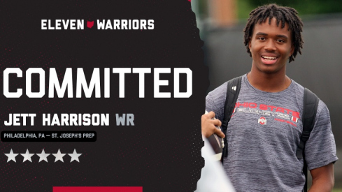
Five-star 2028 wide receiver Jett Harrison, the younger brother of Marvin Harrison Jr., commits to Ohio State.
Five-star 2028 wide receiver Jett Harrison, the younger brother of Marvin Harrison Jr., commits to Ohio State.
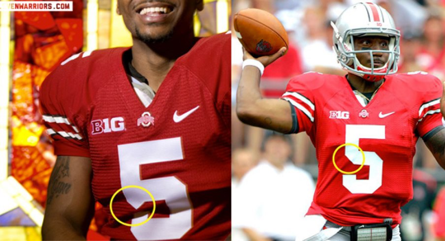
This isn't quite uniform news on the order of Nike's Pro Combat or Rivalry systems, but based on photographs that accompanied Braxton Miller's recent cover story in Sports Illustrated, it appears as if the Buckeyes will be going with a new font for football jersey numbers.
The change isn't dramatic and would probably slip the attention of most, but not our Walt Keys, who pointed out the addition of a triangular serif on the stem of the 5 in a recent photo taken by SI for the article. The cover photo is a stock action shot from last season, and as such, doesn't feature the triangular serif, but the photos within the article show off a new font used for numerals.
But, couldn't that just be a fold in the garment? We considered that, but concluded it wasn't. Here's a larger version of the image on the left.
The uniforms Ohio State wore for the Michigan game in November sport a similar stylized number, but those were one-offs, of course [Ed – As NKohl13 points out below, this appears to be the same font used in the 2011 Rivalry unis]. This appears to be a shift for the base home (and we presume, away) jerseys the Buckeyes will wear in 2013.