BOOM
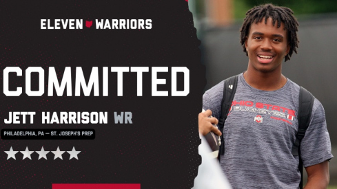
Five-star 2028 wide receiver Jett Harrison, the younger brother of Marvin Harrison Jr., commits to Ohio State.
Five-star 2028 wide receiver Jett Harrison, the younger brother of Marvin Harrison Jr., commits to Ohio State.
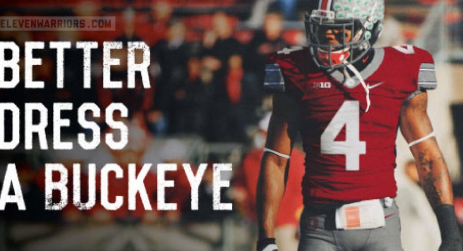
The Buckeyes are overdue.
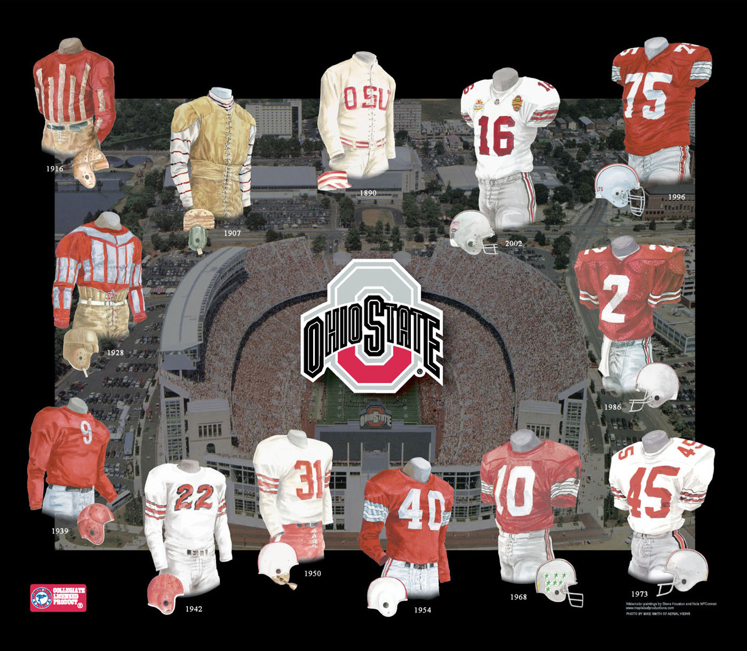
No, not for a national championship — or even a B1G title — but for an overhaul of their on-field football brand. In the interest of expediting a sartorial change, I distilled my own thoughts on the topic — what works in a uniform, what doesn’t — and created what I believe to be the perfect uniform for the Ohio State football Buckeyes.
Any change to a uniform as iconic (though not nearly as undisturbed as many claim it to be) as OSU’s brings with it screams of foul play and outrage. But, hey, even Penn State updated their threads last year — proof that if you can improve the existing model, it’s a smart move.
Let’s start with the logo. After a recent redesign, the “Athletic O” has rightly received a lot of consternation and ire — though, in truth, the original mark was terribly outdated for quite some time. It was busy, hard to read, screamed of “John Cooper!” and, most importantly, felt contradictory to just about everything else OSU does.
For a second about face, I’ve essentially adapted this logo that Nike developed a few years back. I’ve always felt it had a bolder, more collegiate feel that better exemplifies OSU athletics. You’ll notice that I’ve also deepened the scarlet and gray; as is, the current scarlet trends a bit magenta at times.

Now, onto the uniforms.
To kick off this project, I looked at the team’s current unis, as well as past Buckeye get-ups and Nike’s recent one-offs, cherry-picked my favorite elements, then figured out what worked with what.
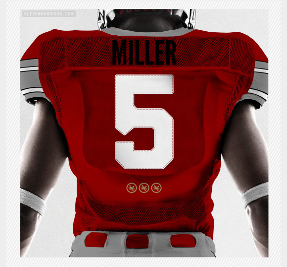
I always liked the old gray sleeve-striping, so I’ve brought that back, but kept it the same for home and away — I never liked the red on the away sleeves.
To add a little variation, I added a contrasting collar and belt and adapted a few elements from this past year’s Michigan game uniforms: the dull chrome helmets (with a thinner stripe), the green reflective Buckeye stickers and the slightly reflective numbers.


I didn’t want this to simply turn into a Frankenstein uniform. I wanted to put my own stamp on the set, so I looked abroad and pulled in an element from international soccer.
National teams and clubs have a tradition of adding stars above their crests to commemorate a major championship. I’ve adapted this here, creating a cluster of golden Buckeyes below the number on the back of the jersey, signifying how many times a given player has played on a team that beat Michigan.
Freshmen will have zero Buckeyes, and a fifth-year senior could have five or more when he takes the field for his final bowl game.
As I said, these are just the ideas of one designer’s unrequested thoughts. Each and every Buckeye fan, alum, student and athlete has his or her own view on the subject and it seems they often fall on deaf ears these days.
But, if you’re listening Gene Smith, can we at least fix the logo?