Eleven Warriors - A Buckeye Sports Blog

Eleven Warriors - A Buckeye Sports Blog RitaRod Safari Gear at 11W Dry Goods
You're Stepping into Manhood Right NowFootball ScheduleBasketball ScheduleRSS

Are Alternate Jerseys Coming for The Game?

Rumors have been swirling for a few days (by many people) that Ohio State has alternate jerseys in the works and if the rumors are true, they will be making their debut for the Michigan game.

I know around these parts, we are not big fans of the recent alternate jersey trend, because most the time they are ugly, but that is the price schools pay for signing multi-million dollar contracts with the apparel companies. However, we will be even less fans of the idea, if they are trotted out for The Game and we can’t think of any good that could come from that situation.

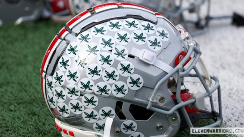
What are your feelings? The link below provides the rumored design and word is, they’re coming with all white helmets.

UPDATE: Gene Smith and Shelly Poe are both saying it’s not going to happen.

UPDATE (x2): OSU issued a press release announcing they WILL be wearing the alternates after all, which they profess honor the 1954 National Championship team.

http://www.realcavsfans.com/showthread.php?p=660033

Email Bookmark and Share

166 Responses

  1. southbaybuckeye says:

    why does nike insist on taking a shit on tradition?

    • Luke says:

      3 year old tradition!!! WOOOOOOOO OLD AS TIME!

      • southbaybuckeye says:

        the only thing that has really changed is the stripe on the sleeve, and even that was from older jerseys so i am ok with it.

        but this looks like an atlanta falcons jersey

        • Ken says:

          Yeah, SBB, my 1st reaction is an Atlanta Falcons jersey. I don’t have a problem with the white jersey; what does the scarlet jersey look like? Regarding going to an all-white helmet; no fuckin’ way!! That is a show-stopper for me; the current OSU helment is classic. Give Phil Knight his goddamn money back at that point.

      • southbaybuckeye says:

        next thing you know will have one red shoulder…..

  2. Hayhayhay says:

    Gross.

  3. buckeye says:

    No way will this happen.

  4. Mike says:

    God I hate this. It isn’t like they couldn’t do something special for the game, but go to throwback jerseys, or at least something that still looked like it belonged at Ohio State.

  5. Mike says:

    Also, Rob Oller at the dispatch says no special jerseys, straight from Gene Smith’s cell phone.

    http://blog.dispatch.com/buckeyesblog/2009/11/no_silver_jersey_on_horizon.shtml

  6. BuckeyeSki says:

    No way…..that is AWFUL!

  7. Sam says:

    Terrible. Shoot me if this happens. No, really, shoot me. I’ll get far more pleasure out of it than you will.

  8. Baba Booey says:

    no matter what they do with the jerseys you can’t get rid of the silver bullet helmet

  9. comoprozac says:

    I don’t know what all the hub-bub is all about. They’ve made a couple of minor changes over the years to the uniform. As long as they don’t mess with the helmets, I’m good with it. Actually, just once, I’d like to see them wear black jerseys, but it will never happen.

    It’s funny how so many people get caught up in traditions like the uniform but complain incessantly about the old-school offensive scheme or the general conservatism of Tress and his staff.

    • southbaybuckeye says:

      i hope they do it like Tennessee did……..

      wait no. no i don;t

    • is it Saturday yet? says:

      black jersey with the silver helmets? that would look bad @$$ (IMHO)

      • southbaybuckeye says:

        and then they can move the team to oakland

      • Brian says:

        I NEVER want to see a black Jersey. Black is not mentioned in the colors, It’s not Scarlet Gray and black. White helmets would be absurd. I hope they do tell Nike to F off. I don’t care about minor changes in the uniform. i’m not suggesting we need to be like Penn State and never change anything on the uni. But to have silver jerseys and white helmets, or a Black Jersey, well it’s just not OSU football to have black jerseys running all over the place. If you think it’s ridiculous to not like the idea, more power to you, but if there comes a day with a black jersey, then we’ll have “blackouts” and those themed everyone where the same color shirt games are just dumb, except for Penn State where it actually does look kind of cool to have 107,000 people wearing white and the place looks cool. But black outs, red outs, orange outs, whatever else are just dumb.

        • southbaybuckeye says:

          i disagree, white outs are just as gimmicky

          • Brian says:

            Didn’t it start there though? At least they are original.

          • southbaybuckeye says:

            i guess it started there technically. but to hear musberger slobber all over himself every saturday when he talks about it is pretty annoying.

        • BossHawk says:

          Woody changed all of that when he wore that black cap. Black is an “official” unofficial color (if that makes sense). Have you seen the hockey jerseys? I’ve seen a black one and it’s sharp. Think about the silver bullet helmet. Silver isn’t one of our official colors. Gray would be official but that silver bullet is the prettiest helmet in college football. White is not our official color but we sure have white jerseys. I’m ready for a change. Let’s have some variations. Keep what we have but let’s keep some alternatives available for some special occasions. I wish they would have rolled out something special for the butt whippin’ we’ll place on the big mouth Penn State Nitwit Lions. GO BUCKS!!!

  10. Josh_Alum says:

    I’d like to see them go back to actual scarlet, instead of red, jerseys, especially if they put on the old school gigantic numbers.

  11. Bup bup bup says:

    Wow those are terrible

  12. bucksfanxc says:

    If they lose in those, we will never do it again. And we will never hear the end of it from Wolverweenies

  13. Itchy Fred says:

    I’m not against updating the jersey from time to time, but a home uniform and an away uniform is enough, I’m not in favor of any alternate uniforms. Regardless if the picture is legit or not, the idea of an alternate jersey gets a thumbs down from me. On a loosely related note, I still prefer the old “field art” at Ohio Stadium over the current ‘we swear we aren’t Wisconsin’ version.

  14. tampa buckeye says:

    No Basketball preview? What gives. Show PJ Hill and the boys some love.

  15. ohiokris says:

    sick sick uniforms, Oregon has the best in college football, i only hope ohio state could one day look that damn bad ass. Don’t get me wrong though i love our uni’s but the black stripe on the scarlet jerseys is just terrible, were not wisconsin. i welcome any change to that.

    • southbaybuckeye says:

      you just achieved a negative cred status for the oregon remark. were you also a huge xfl and arena league fan??

      • ohiokris says:

        are you serious? have you seen all of oregon’s uni’s?
        no i didn’t watch XFL, but i did watch Arena, and most of their jerseys sucked.
        Oregon is on a whole different level when it comes to jerseys. Most resist change but they embrace it.
        side note. (i’m also a graphic designer)

        • southbaybuckeye says:

          those tribal winds? really?

          they’re on a whole different level of suck.

          • southbaybuckeye says:

            wings*

          • ohiokris says:

            you have no clue when it comes to style do you.
            what do you think the buckeyes look liked in the 1920’s, 40s, 50’s, 60’s, 70’s 80’s, 90’s.
            they wore something different, stop being a stick in the mud and let change happen.

          • southbaybuckeye says:

            please teach me a lesson in stlye, heidi klum….

          • ohiokris says:

            BTW the tribal wings your talking about, They’re actually a reference to nike. Nike in greek means “Victory” so its a Greek reference to leafs that adorn the victor. like the olympics. And with nike being formed at Oregon they will always be tied together.
            I know your head must hurt by now but go lay down and rest, you should be ok in a fews hours.

          • BuckeyeSki says:

            OhioKris-

            You can now leave the runway.

          • southbaybuckeye says:

            you’re telling me things i know about nike, what it means, phil knight bla bla bla mr impressive graphic designer. what do you people top out at, 60k on average? amateur…

            the tribal wings are still gimmicky and lame.

            “embrace change”, lemme guess, Barack… is that you?

          • BuckeyeSki says:

            Obama said things were gonna be DIFFERENT!

          • southbaybuckeye says:

            I can’t believe Bruno is trying to tell me about fashion.

            don’t those skinny jeans hurt your nads buddy?

          • ohiokris says:

            sounds you have some issues there tater tots, i’m a graphic designer not a fashion designer. i was only trying to explain the reasons for the leafs on their shoulders, if you wanna make this about money we can do that, but your not gonna like what i make a year.
            walk away while you still can.

          • southbaybuckeye says:

            i don’t need to walk away. i’m sure of that.

            point is, if you need a lengthy explanation of why you have certain things on your unis, they suck in my book. i don’t want to read a paragraph about the Greek language, victory leaves and all that nonsense to understand why my team wears the unis they wear. does it say that in scUM’s media guide? no. PSU? no.

            Oregon, while recently successful isn’t exaclty a long-standing college football power house. they need those things to get attention, ohio state, psu, etc do not.

            besides, what happens to ND in their green alternates? ugh…

          • ohiokris says:

            kinda like the wings on the michigan helmets. They serve no purpose other than an homage to the past.
            You know thats just a reference to the yale teams of old that used the wings so the QB could tell his WR’s from the DB’s. Back when they all looked alike, leather helmets and brown uni’s. But that would take a few minutes to look that up, so they should just take them off by your logic.

          • southbaybuckeye says:

            do the wings serve a purpose other than mimicking tribal tattoos of the 1990’s? do they make the ducks easier to spot for the quarterback?

          • Emilio Estevez says:

            Ducks Fly Together!

          • southbaybuckeye says:

            they also never say die if memory serves…

          • buckeye in athens says:

            this conversation is getting ridiculous.

          • Nik says:

            actually the winged helmet is from Princeton, NOT Yale. Also, it’s not an homage, it was brought over by the coach…

            so please, just leave ohiokris

          • ohiokris says:

            but that still serves my point nik, thank you.
            You just made it more clear, btw nice job i hope Wiki helped out on your search.

        • flipbuckeye says:

          As a graphic designer, you should know that less is more.

    • Dave Lambers says:

      Oregon? What are you smoking?

  16. Old_school says:

    Has anyone else noticed how ever since the most recent jersey update (2006), when the home jerseys lost the gray stripe and replaced it with the black stripe, we haven’t won any “big” games?? Coincidence?!?!

  17. Bup bup bup says:

    THIS ALTERNATE UNIFORM IS TEARING US APART

    also I note that both smith and Poe specifically referred to a silver uniform, I want a reporter to hold the pic of that white one in their face and say “yo. what the fuck man. what the fuck”

    • southbaybuckeye says:

      supposedly both teams will be wearing throwbacks from 1961 now…

      who knows. either 1961 of 2061 are our options right now. i choose… neither.

      we’ll see Nov 21st I guess…

      • Luke says:

        I believe these uniforms we’re seeing above ARE the 1961 throwbacks. It’s a bad angle, which doesn’t make the font look quite as it should. http://img.photobucket.com/albums/v710/richswerb/leshorvath.jpg or http://www.brutusonparade.com/img/statues/billWillis.jpg is likely what we should anticipate.

        • southbaybuckeye says:

          how are they the 1961 unis? they don’t even look alike.

          • Luke says:

            It’s an odd, narrow angle. They’re re-interpolations on the look worn by the 1954 team, so ignore the Horvath picture above.They’re going to look very similar to the Willis one’s pictured second and I imagine white helmets like these: http://ecx.images-amazon.com/images/I/21Mj4AYHEsL._SL500_AA184_.jpg but again, modernized (and to be fair, I believe the white helmets were only worn from ‘49-’53 and grey was first introduced in the mid 50’s). For those claiming “OMG THEY LOOK LIKE TEH FALCONS”, um, maybe really superficially? http://product.images.fansedge.com/61-00/61-00860-F.jpg . The font on the numbers are a lot more curved with a pretty deep drop shadows and the sleeves look nothing alike. I mean, yes, they do also wear red and white, but c’mon.

          • southbaybuckeye says:

            i am one of those that shouts “they look like teh falcons”

            sleeves especially.

            since when does “throwback”= “interpenetration of an actual throwback if it were brand new in the year 2040″?

          • a bag of doritos says:

            people are saying OMG THEY LOOK LIKE TEH FALCONs, bc um, they do.

            unless, you have something in mind with you “superficial” comment. maybe some crazy metafashion ideas? i can’t really envision how jerseys could be alike other than, you know, superficially.

          • Luke says:

            Superficial, meaning “not thorough, or deep” as in cursory, not superficial as in “from the surface”.

            And while the obsessive study of athletic aesthetics is just a hobby, I don’t know how you can argue with a straight face they’re identical. Perhaps if someone argued on behalf of the Houston Texans’ numeral typography (http://www.fogdog.com/graphics/product_images/p670279reg.jpg) or (again admittedly a huge abstract) the New York Giants recent roads http://www.shopskybox.com/cart/images/Giants%20Jacobs%20white%20flat.jpg (at least the sleeves are vaguely reminiscent of one another), MAYBE? But the Falcons’ sleeves aren’t really alike at all: http://farm3.static.flickr.com/2556/4076302637_21b9e7cc2d_o.jpg

            Again, if they aren’t y’all’s cup of tea, more power to you. They’re wearing them either way. 92% of Dispatch readers strongly objected to the switch to the red sleeves in 2006, but I’m willing to bet 75% of those are wearing replicas of the new old design now. I personally couldn’t careless if the Bucks came out in maize & blue with winged helmets, so long as they win (and preferably by 100).

  18. Bup bup bup says:

    If you ain’t no punk holla we want throwbacks

  19. GoBucks says:

    Need to wear the home jersey from 68 with the numbers on the side.

  20. BuckeyeChief says:

    JerseyGuru,
    Thanks. I couldn’t remember exactly when it was. Joey Galloway’s hey day…

  21. Matt says:

    According to a childhood friend of Dane Sanz, they have been planning this since the beginning of the year, and the players are very excited about it. If the jerseys are true throwbacks, I am too; if they Falcons imitations, I am not.

  22. Bucksfan says:

    Responding to Update #2: They’re f*ing with the uniform for the Michigan game?!?! We’re on a 5 game W streak! WHY? I’m about to JoePa my pants.

  23. VB Buckeye says:

    I like the throwback idea as well, but if they’re anything like that picture no way!

  24. Matt says:

    In non-jersey news relating back to a conversation from a few weeks back: Dorian Bell will be redshirting, per Fickell. This is a good thing.

  25. comoprozac says:

    I apologize if this was already mentioned, but I didn’t see anything. Rittenberg is reporting that it’s a throwback to the ‘54 championship team. So, not all that bad.

    http://sports.espn.go.com/ncf/news/story?id=4624001&campaign=rss&source=NCFHeadlines

  26. Hayhayhay says:

    Yep, the Lantern is also reporting that it’s a 1954 throwback to honor that year’s national championship team.

    http://www.thelantern.com/sports/bucks-to-unveil-new-jerseys-for-michigan-game-1.861105

  27. Joe Pa's Underoos says:

    wash me:(

  28. bucks says:

    everyone just calm down and wait until they unveil them on the 15th. until then no one knows for sure what they will look like. I saw a picture on facebook from some place in england that had buckeye jerseys like that and it was about a year ago so maybe (hopefully) that isn’t them. hopefully they are classic throwbacks but just wait for them to come out and then we can all bitch about it. if we win the next two games though i’m sure we won’t have much of a problem with it.

  29. BuckeyeChief says:

    They shouldn’t have anything to do w/ Les Horvath…. Should be more like what Hopalong wore.

  30. BuckeyeCIC says:

    All about the ALMIGHTY DOLLAR

  31. Bup bup bup says:

    “the al ighty ollar?!?”

  32. BossHawk says:

    Why are loyalists getting so upset? It’s time for a change. Maybe football philosophy will change along with it. Hey folks! It’s time we come into the Twenty-first century. Buckeye fans say “we don’t need to change. We have the best looking uniform in college football (and I agree).” Just don’t totally change it. It’s not like our uniforms look like the uniforms Pete Stinchcomb and Chic Harley wore. The Buckeye uniform has changed dramatically over the years. Just check out the uniforms of the 20’s, 30’s, 40’s, 50’s, and early 60’s. You would never know they were Buckeye uniforms. Therefore, don’t talk to me about tradition and the uniform. That’s our problem. We don’t accept change too readily. It’s time to change our mindset. I hope this unveiling is something symbolic of change we’ll see in our team on the gridiron. Also keep in mind it’s only for one game. We’ll still maintain those beautiful scarlet and gray uniforms. GO BUCKS!!!!

    It’s funny but I had been approaching the OSU coaching staff with an idea for an alternate uniform that we might wear during non-conference clashes and bowl appearances. I’d like to know what you think. Please visit the following link:

    http://www.flickr.com/photos/bosshawk/?saved=1

    • Buckeye20 says:

      Dude…that’s pretty cool shite right there…they look retro but yet very unique. Not sure about the black pants,,,maybe grey with the same design…good work for sure!!

    • southbaybuckeye says:

      so that’s what playing football on the moon would look like…. interesting…..

    • bobobuckeye says:

      UGLY UGLY UGLY – Those seriously STINK and the Woody Sticker needs to go. This is about the Ohio State University AKA the BUCKEYES – NOT THE WOODYS!

      Sport your Wood elsewhere!

      • BossHawk says:

        It’s called progressive variation or change. You know what I mean. You’re probably the “hillbilly” that still likes watching the games on black and white with aluminum foil on the antennas. Don’t be afraid of change. It doesn’t hurt. GO BUCKS!!!!

        • southbaybuckeye says:

          he didn’t like your jerseys, big deal. maybe he should have been a bit nicer but he’s entiteled to his opinion. that’s no reason to resort to calling him a hill billy.

          but, with that said, they kind of remind me of nascar jump suits.

          i’m not saying you’re not talented, because that would be untrue, but those are not football unis IMHO

          • BossHawk says:

            You’re exactly right. He is entitled to his opinion and you are too. I apologize for calling him a hillbilly. That was inappropriate. Hopefully, whatever our Buckeyes wear on November 15; they’ll do us proud! GO BUCKS!!!!!

          • southbaybuckeye says:

            he just made the classic mistake of “calling your baby ugly” as we say in my line of work.

            side note: i don’t like “ohio” we’re ohio state. just a pet peeve of mine.

            the helmets would work nicely for hockey

    • tampa buckeye says:

      Don’t they already sell those at wal-mart?

  33. jdm says:

    oh shit. THE atlanta buckeyes.

  34. NorCal Buckeye says:

    Wow, all those people getting WAY too worked up about “their” jersey’s getting changed need to chill the F out. First off, it’s not a change, but a one time deal. Get over it. The more you take it as a personal insult, the more retarded you sound. They look sharp and might show a few people that the program isn’t too stale. ONE GAME, get over it. It’s not like YOU’RE wearing it on the field, nor did anyone on here likely play. Button it up and go spread some hate on the PSU blogs, instead of getting into pissy arguments and debates.

    BTW, SouthBay, way to lose all credibility and try to insult a person you’ve never met (ohiokris), and pull the “I bet I make more than you do” comment. That was totally m!ch!g@n-elitist behavior. Now bump your virtual-chest, act tough and start a blog fight. Mature. Maybe you can go have pointless arguments with the army of the idiots on ESPN.com’s website.

    • is it Saturday yet? says:

      good comments

      • German Buckeye says:

        This whole thread sounds like “Barrens chat” in the on line game, “World of Warcraft”. Get a life peeps and worry more if T.P is going to fold like my wallet after my wife empties it or if he’ll actually perform well under pressure in a big game. Who cares how they look, I just want my Buckeyes to get on the winning track again.

        • southbaybuckeye says:

          referencing world of warcraft….

          negative eleventy billion points.

          • BuckeyeSki says:

            Dude-

            There is not a pronouncable number that you can assign the negative to for that reference…..

            On a side note, visit BlackShoeDiarriah post Poisiounus Nuts for a nice chuckle…..

    • southbaybuckeye says:

      i think he was the one that said somethign to the effect of “making my head hurt” with his superior intellect.

    • Brian says:

      I just don’t see how it’s any different the Georgia or Tennessee wearing a Black jersey as a one time deal. I don’t care if it’s to honor a past team, they aren’t wearing the exact jersey from that team, they are wearing a Nike Interpretation. Nike just wants to sell more jerseys!

  35. El Caballo de Sangre says:

    If there’s ANY throwback I’d like to see, it’s the uni that featured the silver helmets w/ a wide-ass red stripe down the middle and the player # in black on the side. I believe (I can’t seem to find a link to any images right now because teh Google is swamped w/ today’s news) that they also featured basically plain red/white jerseys w/ rounded, drop-shadow #s (w/ some kind of font-ish detail), and all-silver/gray pants (no stripe).

    That’s a uni I could get behind. This one – no matter how authentic – is just too Falcons-ish.

  36. Buckeye20 says:

    I am usually all about tradition, but I gotta admit that white jersey wouldnt be bad if we wore different pants with it and kept the helmet. If the pants matched the jersey and we kept the helmet as is could be bad ass.

  37. Denny @ WFNY says:

    We need Paul Lukas to save us with info here.

  38. Duran says:

    Would love to see Scarlet Pants, Silver Jerseys!

    Or Just Silver Jerseys.

    • flipbuckeye says:

      Scarlet pants? Uh…

      • NorCal Buckeye says:

        Haha, I’d agree. I thought at first it’d be rad to try red pants, but that’d be pretty off. Helmets too, I personally wouldn’t like to see them changed because of the look and the Silver Bullets moniker.

        Those jersey’s do look sharp though, if the pants and helmets remain the same I think they’ll be an overall success. I may just have a crummy eye or it may be the shadows in that photo, but I think the jersey is all white. Nothing crazy like black or pink. That I agree would look dumb.

        Keep them helmets silver!

  39. southbaybuckeye says:

    Breakign news: State Penn is also busting out some alternate uni’s this season. Paying homage to their past, present and future.

    http://comps.fotosearch.com/comp/BLD/BLD035/multi-ethnic-criminals-prison_~BLD064584.jpg

  40. iball says:

    1958 OSU uni’s, pretty sweet, IMO.

    http://www.sportsartifacts.com/fb58street1.JPG

  41. BuckeyeChief says:

    Last post on it I swear… From Tress, an alternate uni is in the works over the next few months (via Ken Gordon twitter)

  42. flipbuckeye says:

    Looks like we aren’t the only ones in on this. Nike’s got FSU some alternates too:

    http://www.seminoles.com/sports/m-footbl/spec-rel/110509aac.html

    • southbaybuckeye says:

      those are gross

      • BuckeyeChief says:

        In case you all didn’t get it, that slide show, with the jersey posted at the beggining of the thread, and Tressel’s alternate jersey quote means we will be wearing that other jersey sometime next year…those gloves are bad ass though.

        • southbaybuckeye says:

          yeah, i get it. we’ll look like we should be playing football on mars very soon.

          • buckeye20 says:

            That FSU shite is bizarre…won’t be long and everyone will be sporting unis like that…The Bucks included.

          • southbaybuckeye says:

            we will also relocate the shoe to venus or saturn.

            they just remind me of football uniforms gone bad, like any given sunday. great movie. awful unis.

  43. Perry Peck says:

    Uniforms change and change is good it reflects the changing times we live in. If the Jerseys never changed people would say it is old fashion. It’s funny but in ten years they will change it again and we will be having this same debate! Cool out everything is going to be ok.

Leave a Reply

[Get a Gravatar] [Allowed Tags]

Fresh

Fresh
StubHub

BB: Ohio State @ Indiana - 02/10/10

BB: Ohio State @ Illinois - 02/14/10

BB: Purdue @ Ohio State - 02/17/10

My Buckeye RoomHOMAGEAmerican Family Insurance